


<!DOCTYPE html>
<html>
<head>
<link rel="stylesheet" href="https://maxcdn.bootstrapcdn.com/bootstrap/3.3.7/css/bootstrap.min.css">
</head>
<body>
<div class="container">
<h2>Responsive Image</h2>
<img src="/home/careerride2/Downloads/download.jpg" class="img-responsive" alt="download" width="304" height="236">
</div>
</body>
</html>

<!DOCTYPE html>
<html>
<head>
<title>Scrollspy in Bootstrap</title>
<link rel="stylesheet" href="https://maxcdn.bootstrapcdn.com/bootstrap/3.3.7/css/bootstrap.min.css">
<style>
body {
position: relative;
}
#page1 {padding-top:10px;height:500px;color: #fff; background-color: #1E88E5;}
#page2 {padding-top:10px;height:500px;color: #fff; background-color: #673ab7;}
#page3 {padding-top:10px;height:500px;color: #fff; background-color: #ff9800;}
#page41 {padding-top:10px;height:500px;color: #fff; background-color: #00bcd4;}
#page42 {padding-top:10px;height:500px;color: #fff; background-color: #009688;}
</style>
</head>
<body data-spy="scroll" data-target=".navbar" data-offset="50">
<nav class="navbar navbar-inverse navbar-fixed-top">
<div class="container-fluid">
<div class="navbar-header">
<button type="button" class="navbar-toggle" data-toggle="collapse" data-target="#myNavbar">
<span class="icon-bar"></span>
<span class="icon-bar"></span>
<span class="icon-bar"></span>
</button>
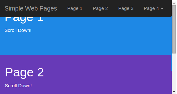
<a class="navbar-brand" href="#">Simple Web Pages</a>
</div>
<div>
<div class="collapse navbar-collapse" id="myNavbar">
<ul class="nav navbar-nav">
<li><a href="#page1">Page 1</a></li>
<li><a href="#page2">Page 2</a></li>
<li><a href="#page3">Page 3</a></li>
<li class="dropdown"><a class="dropdown-toggle" data-toggle="dropdown" href="#">Page 4 <span class="caret"></span></a>
<ul class="dropdown-menu">
<li><a href="#page41">Page 4-1</a></li>
<li><a href="#page42">Page 4-2</a></li>
</ul>
</li>
</ul>
</div>
</div>
</div>
</nav>
<div id="page1" class="container-fluid">
<h1>Page 1</h1>
<p>Scroll Down!</p>
</div>
<div id="page2" class="container-fluid">
<h1>Page 2</h1>
<p>Scroll Down!</p>
</div>
<div id="page3" class="container-fluid">
<h1>Page 3</h1>
<p>Scroll Down!!</p>
</div>
<div id="page41" class="container-fluid">
<h1>Page 4 Submenu 1</h1>
<p>Scroll Down!</p>
</div>
<div id="page42" class="container-fluid">
<h1>Page 4 Submenu 2</h1>
<p>Scroll Down!</p>
</div>
</body>
</html>
<!DOCTYPE html>
<html>
<head>
<meta name="viewport" content="width=device-width, initial-scale=1">
<link rel="stylesheet" href="https://maxcdn.bootstrapcdn.com/bootstrap/3.3.7/css/bootstrap.min.css">
<script src="https://ajax.googleapis.com/ajax/libs/jquery/3.2.1/jquery.min.js"></script>
<script src="https://maxcdn.bootstrapcdn.com/bootstrap/3.3.7/js/bootstrap.min.js"></script>
</head>
<body>
<div class="container">
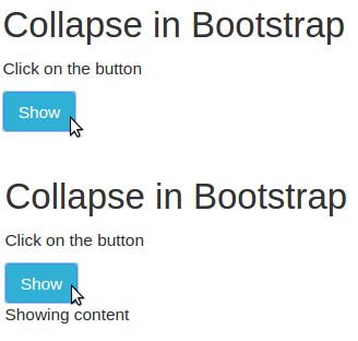
<h2>Collapse in Bootstrap</h2>
<p>Click on the button</p>
<button type="button" class="btn btn-info" data-toggle="collapse" data-target="#demo">Show</button>
<div id="demo" class="collapse">
Showing content
</div>
</div>
</body>
</html>
<ul class="list-group">
<li class="list-group-item">First</li>
<li class="list-group-item">Second</li>
<li class="list-group-item">Third</li>
</ul>