<!DOCTYPE html>
<html>
<head>
<style>
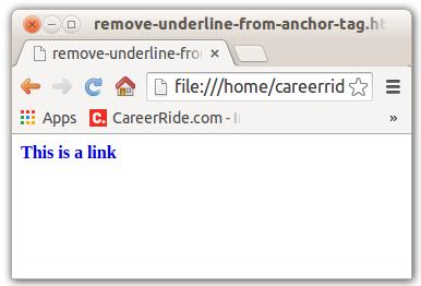
a{
text-decoration:none;
}
</style>
</head>
<body>
<b><a href="default.asp" target="_blank">This is a link</a></b>
</body>
</html>
<!DOCTYPE html>
<html>
<head>
<style>
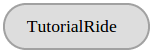
div{
border: 2px solid #a1a1a1;
padding: 10px 20px;
background: #dddddd;
width: 90px;
border-radius: 25px;
}
</style>
</head>
<body>
<div>TutorialRide</div>
</body>
</html>
<!DOCTYPE html>
<html>
<head>
<style>
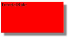
div{
width: 200px;
height: 100px;
background-color: red;
box-shadow: 10px 10px 5px #888888;
}
</style>
</head>
<body>
<div>TutorialRide</div>
</body>
</html>
<!DOCTYPE html>
<html>
<head>
<style>
#borderimg1
{
border: 10px solid transparent;
padding: 10px;
border-image: url(border.png) 20 round;
}
</style>
</head>
<body>
<p id="borderimg1"></p>
</body>
</html>