BulletedList Control
BulletedList control is very rich in displaying the items in different styles. It dispalys the list either in unordered or ordered list. Each list item can be rendered as plain text, a LinkButton control, or a link to another web page.BulletedList control supports the BulletStyle property. The default value of BulletStyle property is NotSet and rendered as in list of bulleted items. Possible values are as follows:
- Circle
- CustomImage
- Disc
- LowerAlpha
- LowerRoman
- NotSet
- Numbered
- Square
- UpperAlpha
- UpperRoman
- HyperLink
- LinkButton
- Text
Example
using System;
using System.Collections.Generic;
using System.Web.UI.WebControls;
public partial class ListControls : System.Web.UI.Page
{
protected void Page_Load(object sender, EventArgs e)
{
if (!IsPostBack)
{
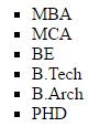
List<string> educationList = new List<string>();
educationList.Add("MBA");
educationList.Add("MCA");
educationList.Add("BE");
educationList.Add("B.Tech");
educationList.Add("B.Arch");
educationList.Add("PHD");
BulletedList1.DataSource = educationList;
BulletedList1.DataBind();
}
}
protected void Style_Command(object sender, CommandEventArgs e)
{
switch (e.CommandName)
{
case "Circle":
BulletedList1.BulletStyle = BulletStyle.Circle;
break;
case "Disc":
BulletedList1.BulletStyle = BulletStyle.Disc;
break;
case "Numbered":
BulletedList1.BulletStyle = BulletStyle.Numbered;
break;
case "Square":
BulletedList1.BulletStyle = BulletStyle.Square;
break;
case "LowerRoman":
BulletedList1.BulletStyle = BulletStyle.LowerRoman;
break;
case "UpperAlpha":
BulletedList1.BulletStyle = BulletStyle.UpperAlpha;
break;
}
}
}
Output:
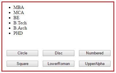
When you click on different button, the button style of list control will be changed accordingly. In this example we have used Command Button concept. If you want to learn Command Button concept, please read chapter three.
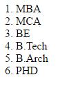
Style = LowerRoman.

Style = Numbered.
Style = Square.