Common Server Control
Label control
Label control and the Literal control are used to display text in a page. Literal control only supports text property, but the Label control has a number of formatting properties.By default, a Label control renders its content in an HTML <span> tag. After executing your application, you can see the respective label <span> tag by using view source on the browser.
The Label control displays text at a particular position on a Web page. Generally Label control is used as the caption of a TextBox.
<asp:Label ID="Label1" runat="server" Text="Label"></asp:Label>
Literal control
It is light weight control. The Literal Control is similar to the Label Control but it does not support properties like BackColor, ForeColor, BorderColor, BorderStyle, BorderWidth, etc. Also you cannot apply a style to a literal control. It is used to display static text on a Web page without adding additional properties or HTML tags.<asp:Literal ID="Literal1" runat="server">It is a Literal Control</asp:Literal>
TextBox control
The TextBox control is frequently used and one of the most important control. It is used to collect information from a user. It is an input control which is used to input the data.The TextBox control contains an important property called TextMode. By using this property you can set textbox as
- SingleLine
- MultiLine
- Password
Password mode masks (text is hidden) the values entered by the user.
MultiLine mode enables user to enter text in more than one line. You can use MultiLine mode, in combination with the Columns and Rows properties. Column specifies the number of columns (Width) and rows specify the number of rows (Height) to display.
Another important property of textbox control is MaxLength. It sets the limit on the number of character that a user can enter into textbox.
TextBox control supports the following event:
TextChanged: It fires, when you change the content or text of the textbox control. TextChanged event only fire, when AutoPostBack property has the value True. By default AutoPostBack property has the value false.
If you change the text of the TextBox control and press tab key from the keyboard, the form is automatically posted back to the server.
Button Controls
There are three types of button control available in ASP.NET:- Button
- Link Button
- Image Button
Button control
Button control postbacks the web page to webserver, when user clicks the button. A Button control can be used as a submit button (default) or a command button.You can also use Button control as a command button. It is useful when you want to group a set of buttons. Button control has property called CommandName. Assign unique CommandName value for each button. Create a single command event handler explicitly, that will handle the event of all command buttons.
Suppose that you have four buttons as given below and want to create all buttons as a command button.
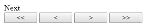
Provide a unique CommandName to each button. As example First, Last, Previous, Next.
Example: Default.aspx
<%@ Page Language="C#" AutoEventWireup="true" CodeFile="Default.aspx.cs" Inherits="_Default" %>
<!DOCTYPE html>
<html xmlns="http://www.w3.org/1999/xhtml">
<head runat="server">
<title></title>
</head>
<body>
<form id="form1" runat="server">
<div>
</div>
<asp:Button ID="Button1" runat="server" OnCommand="Navigate_Command" Text="<<" CommandName="First" Width="65px"/>
<asp:Button ID="Button2" runat="server" OnCommand="Navigate_Command" Text="<" CommandName="Previous" Width="65px"/>
<asp:Button ID="Button3" runat="server" OnCommand="Navigate_Command" Text=">" CommandName="Next" Width="65px"/>
<asp:Button ID="Button4" runat="server" OnCommand="Navigate_Command" Text=">>" CommandName="Last" Width="65px"/>
</form>
</body>
</html>
Default.aspx.cs
using System;
using System.Web.UI.WebControls;
using System.Drawing;
public partial class _Default : System.Web.UI.Page
{
protected void Page_Load(object sender, EventArgs e)
{
}
protected void Navigate_Command(object sender, CommandEventArgs e)
{
switch (e.CommandName)
{
case "First":
Response.Write("First");
break;
case "Previous":
Response.Write("Previous");
break;
case "Next":
Response.Write("Next");
break;
case "Last":
Response.Write("Last");
break;
}
}
}
CausesValidation property: It checks the page validation. By default this property is true for button control. If you set CauseValidation value to false, then it will bypass the page validation.
LinkButton
LinkButton control displays a link instead of a push button. By default, a LinkButton control is a Submit button.Some of the important properties of LinkButton Control are:
CausesValidation: If this property is set as true then validation will be performed when Linkbutton is be clicked. Otherwise it will bypass the validation.
PostBackUrl: It posts a form to a particular page when the LinkButton control is clicked.
ValidationGroup: The group of controls when the LinkButton control causes posts back to the server.
OnClick: Attach a server side method that will fire when this button will be clicked.
OnClientClick: You can attach a client-side script that executes when the LinkButton is clicked.
ImageButton
The ImageButton control is similar to Button and LinkButton controls but it always displays an image. It works as a clickable image. Most of the properties are same as Button or LinkButton.The main difference is ImageUrl and AlternateText property. ImageUrl Gets or Sets the location of the image. AlternateText property provides alternate text for the image.
Let us take an example that will show the use of TextBox and Different type of Button.
Example: Default.aspx
<%@ Page Language="C#" AutoEventWireup="true" CodeFile="Default.aspx.cs" Inherits="_Default" %>
<!DOCTYPE html>
<html xmlns="http://www.w3.org/1999/xhtml">
<head runat="server">
<title></title>
<style type="text/css">
.auto-style1
{
width: 103px;
}
.auto-style3
{
width: 165px;
}
.auto-style4
{
width: 143px;
}
</style>
</head>
<body>
<form id="form1" runat="server">
<table style="width: 76%;">
<tr>
<td class="auto-style1">
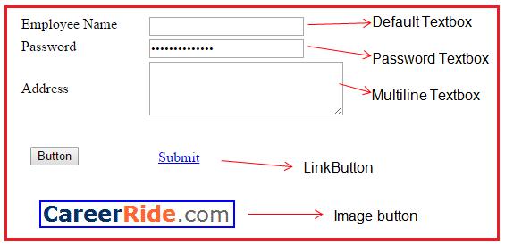
<asp:Label ID="Label1" runat="server" Text="Label">EmployeeName</asp:Label>
</td>
<td class="auto-style4">
<asp:TextBox ID="TextBox1" runat="server"></asp:TextBox>
</td>
<td class="auto-style3"> </td>
</tr>
<tr>
<td class="auto-style1">
<asp:Label ID="Label2" runat="server" Text="Label">Password</asp:Label>
</td>
<td class="auto-style4">
<asp:TextBox ID="TextBox2" runat="server" TextMode="Password"> </asp:TextBox>
</td>
<td class="auto-style3"> </td>
</tr>
<tr>
<td class="auto-style1">
<asp:Label ID="Label3" runat="server" Text="Label">Address</asp:Label>
</td>
<td class="auto-style4">
<asp:TextBox ID="TextBox3" runat="server" Height="54px" TextMode="MultiLine" Width="211px"></asp:TextBox>
</td>
<td class="auto-style3"> </td>
</tr>
<tr>
<td class="auto-style1">
<asp:Button ID="Button1" runat="server" Text="Button" />
</td>
<td class="auto-style4">
<asp:LinkButton ID="LinkButton1" runat="server">Submit</asp:LinkButton>
</td>
<td class="auto-style3">
<asp:ImageButton ID="ImageButton1" runat="server" AlternateText="This is Image Button" ImageUrl="~/logo.gif" BorderColor="Blue" BorderStyle="Solid" BorderWidth="2px" PostBackUrl="~/Default2.aspx" />
</td>
</tr>
</table>
</form>
</body>
</html>
CheckBox Control
A CheckBox control is used to select a single or multiple options from the available choices. For example a person can select more than one cities for travelling.Important Properties of the CheckBox Control
Checked: It is used to check if the check box is checked or not. This is a boolean property.
Text: It is used to get or set the text associated with the check box control. This is a string property.
TextAlign: It enables you to set the text right or left of the check box. By default TextAlign property is set to right.
AutoPostBack: If you want that when you change the status of checkbox (check or uncheck), then set AutoPostBack property true. By default this property is set to false.
Methods:
Focus(): It sets the input focus, to a specific checkbox. Call this method for that check box control.
Events:
CheckedChanged: This event is fired when the checked status of the checkbox control is changed. AutoPostBack property should be set as true to fire this event.
RadioButton Control
Radio Button control is used, when you want to select only one option from the available choices. RadioButton control works in a group. There may be more than one group of radio button. You can select only one RadioButton control from particular radio button group.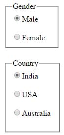
Most of the properties and events are same as CheckBox control but GroupName property is different.
When you use RadioButton, they are not in a group. You can select more than one RadioButton, they are not mutually exclusive. You have to form the group of radio button as above given example. You can create group by assigning similar GroupName to RadioButton.
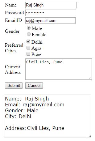
Let us take one example and we will use all the controls that we have discussed till now.
In this example, when user fill all the details and click on submit button, the information will came in last multiline textbox. When user clicks on cancel button, all fields will be empty.
Example
using System;
public partial class EmployeeForm : System.Web.UI.Page
{
protected void Page_Load(object sender, EventArgs e)
{
}
protected void btnSubmit_Click(object sender, EventArgs e)
{
string Name ="Name: "+ txtName.Text;
string Email ="Email: "+ txtEmailID.Text;
string Gender="" ;
if(RDBmale.Checked)
{
Gender ="Gender: "+ RDBmale.Text;
}
if (RDBfemale.Checked)
{
Gender = "Gender: " + RDBfemale.Text;
}
string Cities = "";
if(chbAgra.Checked)
{
Cities +=chbAgra.Text+"\n";
}
if (chbDelhi.Checked)
{
Cities += chbDelhi.Text + "\n";
}
if (chbPune.Checked)
{
Cities += chbPune.Text + "\n";
}
string Address ="Address:"+ txtAddress.Text;
txtResult.Text = Name + "\n" + Email+"\n"+Gender+"\n"+"City: "+Cities +"\n" +Address;
}
protected void btnCancel_Click(object sender, EventArgs e)
{
txtName.Text = String.Empty;
txtPassword.Text = String.Empty;
txtAddress.Text = String.Empty;
txtEmailID.Text = String.Empty;
RDBfemale.Checked = false;
RDBmale.Checked = false;
chbPune.Checked = false;
chbAgra.Checked = false;
chbDelhi.Checked = false;
txtResult.Text= String.Empty;
}
}
Output:
| Field | Control | ID |
| Name | TextBox | txtName |
| Password | TextBox | txtPassword |
| TextBox | txtEmailID | |
| Gender | RadioButton | RDBmale |
| Prefered Cities | CheckBox | chbDelhi |
| Current Address | Multiline TextBox | txtAddress |
| Submit | Button | btnSubmit |
| Cancel | Button | btnCancel |